

Get TDS-C01 Actual Free Exam Q&As to Prepare for Your Tableau Certification
Tableau Actual Free Exam Questions And Answers
Obtaining the Tableau Desktop Specialist certification through the TDS-C01 exam can benefit your career by demonstrating to employers and colleagues that you are proficient in using Tableau Desktop to analyze and visualize data. Tableau Desktop Specialist certification can also help you stand out in a competitive job market and increase your earning potential. Additionally, the knowledge and skills you gain from preparing for the exam can enhance your ability to analyze data and communicate insights effectively.
NEW QUESTION # 60
Which of the following charts types always includes bars sorted in descending order?
- A. Gantt Chart
- B. Pareto Chart
- C. Stacked Bar Chart
- D. Pie Chart
Answer: B
Explanation:
A Pareto chart is a type of chart that contains both bars and a line graph, where individual values are represented in descending order by bars, and the ascending cumulative total is represented by the line.
On the primary axis, bars are used to show the raw quantities for each dimension member, sorted in descending order.
On the secondary axis, a line graph is used to show the cumulative total in percent format.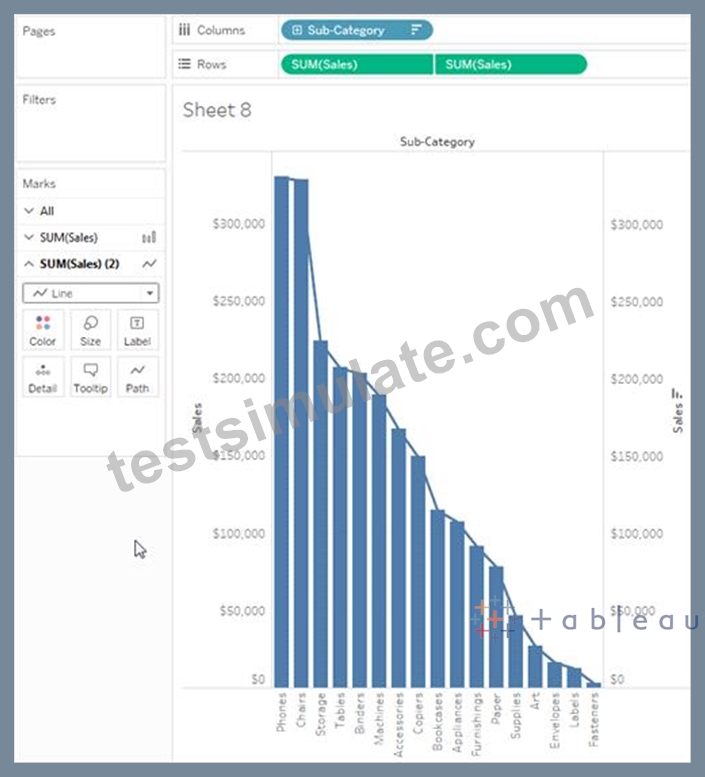
NEW QUESTION # 61
According to Tableau's 'Order of Operations', which of the following filters is applied FIRST?
- A. Measure Filter
- B. Extract Filter
- C. Dimension Filter
- D. Context Filter
Answer: B
Explanation:
According to Tableau's order of operations, the Extract filter is right at the top of the hierarchy. The data filtered in the Extract is then passed on to what we see in the Data Pane. See below:
NEW QUESTION # 62
True or False: We can disaggregate the data, to see all of the marks in the view at the most detailed level of granularity
- A. False
- B. True
Answer: B
Explanation:
Whenever you add a measure to your view, an aggregation is applied to that measure by default. This default is controlled by the Aggregate Measures setting in the Analysis menu.
If you decide you want to see all of the marks in the view at the most detailed level of granularity, you can disaggregate the view. Disaggregating your data means that Tableau will display a separate mark for every data value in every row of your data source.
To disaggregate all measures in the view:
Clear the Analysis >Aggregate Measures option. If it is already selected, click Aggregate Measures once to deselect it.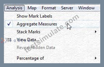
NEW QUESTION # 63
Which data type in Tableau does this icon represent?
Larger image
- A. String
- B. True or False
- C. Boolean
- D. Geographic
Answer: D
Explanation:
The following is the table for the data types in Tableau along with their icons:
NEW QUESTION # 64
Which of the following are valid ways to add Totals to a view?
- A. Using the Marks shelf
- B. Using the Analytics Pane
- C. From the Analysis Tab in the Menu bar on top
- D. Using the Data Pane
Answer: B,C
Explanation:
To add totals to a view using the Analytics pane: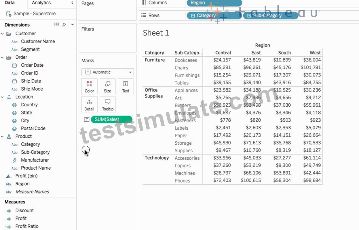
Also, you can add totals from the Analytics tab in the Menu above: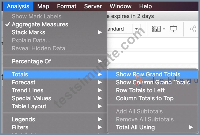
NEW QUESTION # 65
What statement correctly describes a requirement to create a reference line in Tableau?
- A. The reference line must be paired with a date field.
- B. The reference line must be created on a continuous axis.
- C. One of the axis must contain an aggregated measure.
- D. One of the axis must contain a dimension.
Answer: C
Explanation:
In Tableau, to create a reference line, one of the axes in the view must contain an aggregated measure. Reference lines are typically used to add context or additional information to the data in a view, and they are often based on some form of aggregate such as the average, median, sum, etc., of a measure.
NEW QUESTION # 66
Which of the following are the options to export the data used to build the view / visualisations?
- A. CSV file
- B. MS Access Database
- C. JSON format
- D. PDF File
Answer: B
Explanation:
Explanation
You can export the data in a Tableau data source, including all or part of the records from your original data.
Alternatively, you can export only the portion of data used to generate the view.
Since the question mentions the data used to build the view, we'll focus on that :
*Export data in the view to Microsoft Access or .csv*
Export the data that is used to generate the view as an Access database (Windows only) or .csv file (Mac only).
1) In Tableau Desktop, select Worksheet > Export > Data.
2) Select a location and type a name for your Access database or .csv file.
3) Click Save.
4) If you're on Windows, the Export Data to Access dialog box displays to give you the option to immediately use the new Access database and continue working in Access without interrupting your work flow.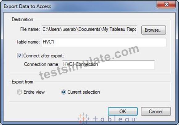
NEW QUESTION # 67
What is the following icon in the Data pane used to do?
Larger image
- A. View Data
- B. Clean Data
- C. Extract Data
- D. Sort Data
Answer: A
Explanation:
View Data allows you to inspect your data in a spreadsheet-like layout. You can view data either for the data source as a whole, or to see the underlying data for an individual mark or a group of marks. In a worksheet, the rows that you see in the View Data window are always scoped to the current selection or the current view.
The View Data window displays as much of the data as possible by default, up to 10,000 rows. Field names are shown as column headers and can be dragged and dropped to change their display order. Click a column header to sort the values in that column.
From the official website:
NEW QUESTION # 68
Which of the following are valid reasons to use a Tableau Data Extract (.tde) over Live Connections?
- A. To support additional functionality such as count distinct
- B. To have access to the freshest possible data at all times
- C. Help improve performance
- D. Fast to create
Answer: A,C,D
Explanation:
From the official documentation, the following are the major advantages of using Tableau Data Extracts:
From Tableau 2020.2 onwards, .hyper is the recommended way since it is faster than .tde!
NEW QUESTION # 69
True or False: All rows from both tables are returned in an INNER JOIN
- A. False
- B. True
Answer: A
Explanation:
The INNER JOIN keyword selects all rows from both tables as long as there is a match between the columns.
Consider 2 tables "Orders" and "Customers".
If there are records in the "Orders" table that do not have matches in "Customers", these orders will not be shown!
NEW QUESTION # 70
You need to invert the color intensity of a quantitative range.
Which option should you use?
- A. Border
- B. Stepped Color
- C. Opacity
- D. Reversed
Answer: D
Explanation: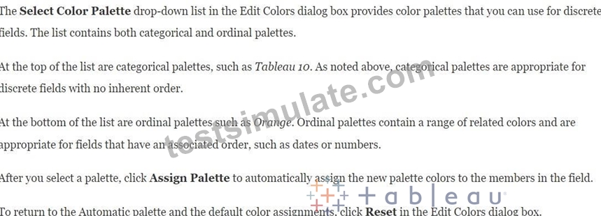
Reference: https://help.tableau.com/current/pro/desktop/en-us/viewparts_marks_markproperties_color.htm
NEW QUESTION # 71
Which of the following is a good reason for using a bullet graph?
- A. Forecasting future sales
- B. Comparing the actual sales against the target sales
- C. Analysing the trend over a given time period
- D. Displaying the year-on-year growth in sales
Answer: B
Explanation:
A bullet graph is a variation of a bar graph developed to replace dashboard gauges and meters. A bullet graph is useful for comparing the performance of a primary measure to one or more other measures. Below is a single bullet graph showing how actual sales compared to estimated sales.
NEW QUESTION # 72
What are two examples of a date value? (Choose two.)
- A. 2020-05-01
- B. January 1, 1995
- C. December
- D. Wednesday
Answer: A,B
Explanation:
MAKEDATE
Reference: https://help.tableau.com/current/pro/desktop/en-us/functions_functions_date.htm
NEW QUESTION # 73
Which of the following is NOT a valid official data source in Tableau Desktop?
- A. SAP HANA
- B. Google Firebase
- C. PostgreSQL
- D. Amazon Redshift
Answer: D
Explanation:
Explanation
Presently, there is no official way to connect your data in Firebase directly with Tableau Desktop.
A workaround however can be to export your Firebase data into Google BigQuery, and then connect it to Tableau Desktop.
But then again, it is a workaround and not an official out-of-the-box solution.
The following are the available Data sources available as of now:
* Server
* File
NEW QUESTION # 74
For which of the following charts, does the Size option on the Marks card not work?
- A. Gantt Chart
- B. Tree Map
- C. Bar Chart
- D. Pie Chart
Answer: B
Explanation:
You can adjust the size for all charts except the Tree Map. You use dimensions to define the structure of the treemap, and measures to define the size or color of the individual rectangles. Treemaps are a relatively simple data visualization that can provide insight in a visually attractive format.
In a Tree Map, the measure itself defines the size and colour! The greater the sum of Measure for each category, the darker and larger its box.
NEW QUESTION # 75
What are two filtering options available for categorical data? (Choose two.)
- A. Wildcard
- B. Condition
- C. Range of Values
- D. At Least
Answer: A,B
NEW QUESTION # 76
Using the dataset, plot a Map showing all the countries, filtered by Market to only include LATAM. Which country in the LATAM Market has the highest shipping delay (sum of total number of days between the order date and the ship date)?
- A. Mexico
- B. Peru
- C. Argentina
- D. Brazil
Answer: A
Explanation:
VERY IMPORTANT QUESTION FOR THE EXAM, PAY ATTENTION
1) To find the number of days between order date and shipping date, we will make use of a calculated field: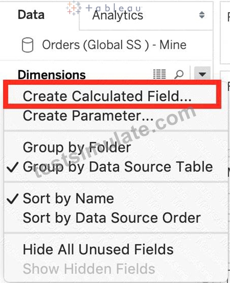
In the data pane, click on the dropdown arrow, and choose create calculated field.
Let's name this calculated field "ShippingDelay" (you can name it anything you want :) )
2) Use the DATEDIFF() function, and pass it the arguments as follows:
'day' depicts that we want to calculate the number of DAYS between the two dates. The first argument is
'start_date' which is the ORDER_DATE (day the order was placed), the second argument is 'end_date', which is the SHIP_DATE (date the order was shipped). So by subtracting as follows: SHIP_DATE - ORDER_DATE, we can find the delay in shipping.
Click OK.
3) You should now have a new measure as follows: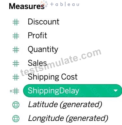
4) Phew! The hard part is done! Now let's filter by Market to include only LATAM: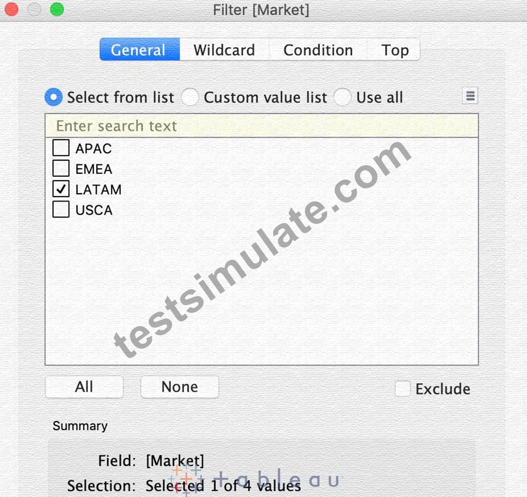
5) Drag Country to the view, and the new calculated field 'ShippingDelay' to SIZE on the Marks Shelf as follows:
*You can also click on Show Text Labels to be sure that you're choosing the Largest value*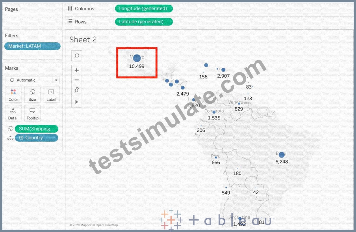
Clearly, Mexico has the highest Shipping Delay!
NEW QUESTION # 77
Which of the following is not a Trend Line Model?
- A. Linear Trend Line
- B. Exponential Trend Line
- C. binomial Trend Line
- D. Logarithmic Trend Line
Answer: C
Explanation:
Explanation
According to the official Tableau documentation, there are 5 types of trend lines which we can work with in Tableau :
1) Linear Trend Line
2) Logarithmic Trend Line
3) Exponential Trend Line
4) Polynomial Trend Line
5) Power Model
Hence, the correct answer is BINOMIAL trend line which is not present in Tableau.
See the following image:
For more information, refer to: https://help.tableau.com/current/pro/desktop/en-us/trendlines_add.htm
NEW QUESTION # 78
Download the Dataset from:
https://drive.google.com/file/d/12AYHfiPWkwBmvH0zbumOURgUX6Az00Rw/view?usp=sharing Using the Time Series Table, create a line chart to show Sales over time. Which Month and Year witnessed the lowest Sales?
- A. September 2017
- B. January 2018
- C. March 2018
- D. December 2017
Answer: B
Explanation:
Follow the steps to get the correct answer : January 2018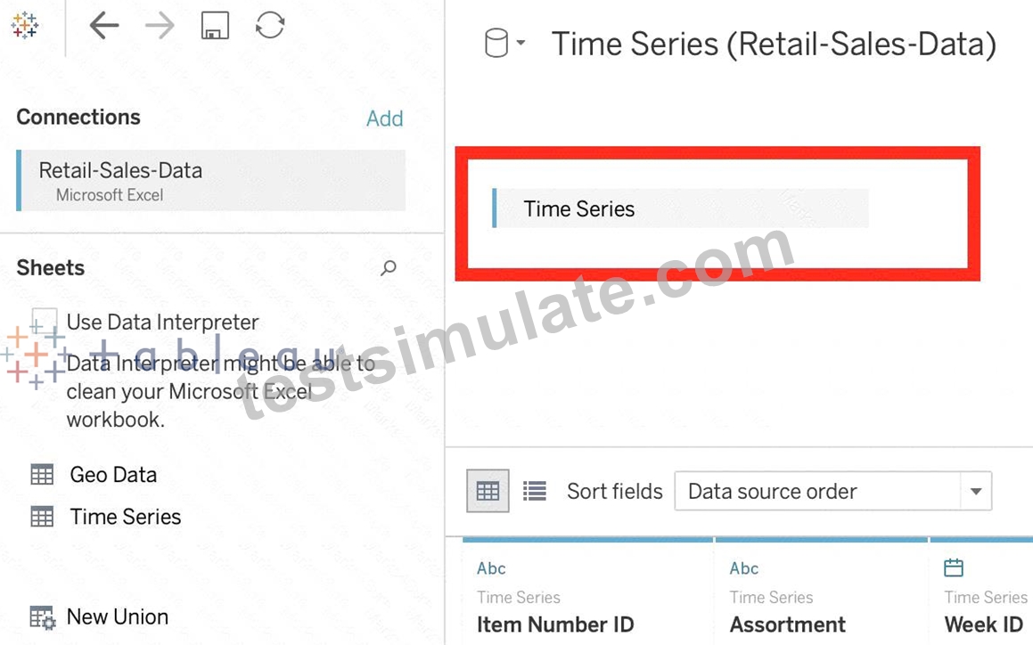
* We are talking about dates, so use the Time series sheet as follows:
* Next, the following should be your view and clearly, January 2018 is the lowest point:
Read more about dates:
https://interworks.com/blog/rcurtis/2017/01/30/tableau-deep-dive-dates-introduction-dates/
NEW QUESTION # 79
Which chart type uses automatically generated sizes that cannot be resized by using the Marks card?
- A. Treemaps
- B. Pie charts
- C. Histograms
- D. Area charts
Answer: A
NEW QUESTION # 80
......
TDS-C01 Questions Truly Valid For Your Tableau Exam: https://www.testsimulate.com/TDS-C01-study-materials.html
TDS-C01 Actual Questions - Instant Download Tests Free Updated Today!: https://drive.google.com/open?id=17hazGCmKDGtK0hcoiP0LRUP30nAglAJC